Penny W. Stamps School of Art & Design
Brand identity, creative direction, campaign design & exhibition graphics
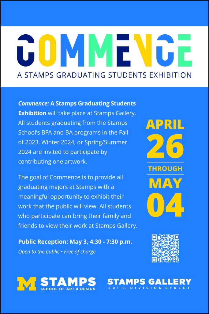
Commence was created as a new annual exhibition celebrating the work of graduating Stamps students. Once the exhibition committee established the name, I developed the visual identity from the ground up, including the wordmark, color palette, and overall creative direction. Because the exhibition was intended to continue annually, I wanted to create an identity that could become recognizable over time while remaining flexible enough to work across different applications and changing student work.
The identity extended throughout the exhibition experience and its promotion, from the large title wall inside the gallery and exhibition signage to posters, social media, email graphics, and other communications. I developed the system so the same visual language could work at very different scales, from something viewed on a phone to a large environmental graphic within the gallery itself.
One of the biggest challenges was student participation. Commence takes place at an especially busy point in the academic year, when graduating students are completing their work and preparing for graduation. Building awareness and creating an exhibition students wanted to be part of required continued outreach and promotion in addition to establishing the visual identity.
That effort has continued to build. Commence completed its third year in April 2026, and student participation has grown each year. Seeing an identity I developed for a new exhibition become an established part of the Stamps graduation experience, with more students choosing to participate each year, has been especially rewarding.

 TBorch Design